Unlocking the Power of Data Visualization: A Beginner's Guide
Data visualization is the graphical representation of information and data. By using visual elements like charts, graphs, and maps, it helps to make complex data more accessible and understandable. For beginners, it’s essential to grasp the basics of data visualization principles, as they play a crucial role in effectively communicating insights. Start with understanding the different types of visual representations and when to use each one. For instance, a bar chart is ideal for comparing quantities, while a line graph excels in showing trends over time.
To unlock the true power of data visualization, consider the following tips:
- Identify Your Audience: Tailor your visuals to fit the understanding level of your audience.
- Keep It Simple: Avoid cluttering your visuals with excessive details; less is often more.
- Use Color Wisely: Implement color to enhance comprehension, but ensure it aids clarity rather than causing confusion.
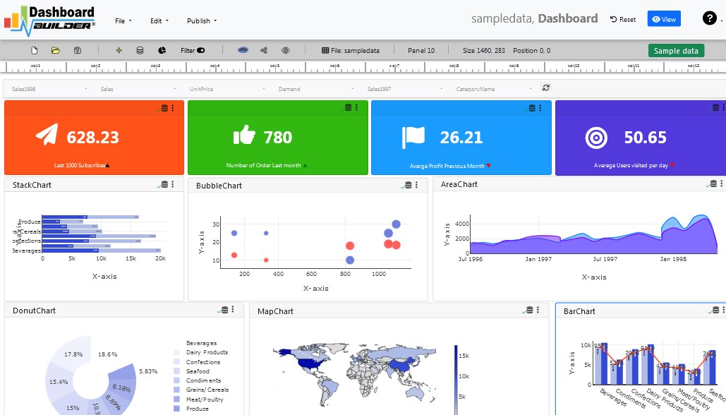
Top 5 Visualization Tools to Transform Your Data Insights
In today's data-driven world, visualization tools play a pivotal role in helping businesses transform data into actionable insights. The right tool can help you present complex data in a way that is easy to understand and analyze. Below, we explore the top 5 visualization tools that stand out for their features and user-friendly interfaces:
- Tableau: Renowned for its powerful data visualization capabilities, Tableau allows users to create stunning, interactive dashboards and visualizations effortlessly.
- Power BI: A Microsoft product, Power BI integrates seamlessly with Excel, offering robust analytics and reporting features that empower users to make informed decisions.
- QlikView: Known for its associative data model, QlikView enables users to explore data from multiple sources and discover hidden insights quickly.
- Google Data Studio: A free tool from Google, it allows you to create customizable dashboards powered by data from different sources, making it a popular choice for marketers.
- D3.js: For those who prefer a more hands-on approach, D3.js is a JavaScript library that allows you to create dynamic and interactive data visualizations on the web.
How Data Visualization Can Drive Business Decisions: Key Benefits Explored
Data visualization is not just a trend; it is a powerful tool that can transform raw data into meaningful insights that drive business decisions. By presenting data in a visual format, organizations can quickly identify patterns, trends, and anomalies that might be missed in traditional data analysis methods. This visual representation helps in making complex data more accessible and comprehensible, enabling stakeholders to grasp the information rapidly and make informed choices. For instance, dashboards that showcase real-time performance metrics can highlight areas of improvement, promoting proactive strategies rather than reactive responses.
One of the key benefits of data visualization is its ability to enhance communication across teams. When data is visualized, it becomes easier for individuals with varying levels of data literacy to understand and engage with the data. This shared understanding fosters collaboration and aligned objectives, as everyone is working from a common set of information. Furthermore, effective data visualization can strengthen the story behind the data, guiding stakeholders toward a unified vision and supporting data-driven strategies. As businesses strive to stay competitive, leveraging data visualization can become a crucial aspect of their decision-making processes.